Behind the Scenes: Two women on a bench
This is the first of a series of posts devoted to stuff I directed or designed. Each entry will feature a low-res YouTube version of a commercial, leader or trailer, production notes, and sometimes a look behind the scenes. For questions or remarks, leave a comment and I’ll be happy to reply! ______________________________________________________________
First up is a 25 second public announcement for the Dutch Brain Disease Foundation. Don’t worry: it’s not as dull as it may sound. Although the budget for this project was limited, we shot it on 35mm film with a stripped-down crew and (for the most part) available light. Before we move on, have a look at it first. The only thing you need to understand from the Dutch narration is that brain diseases are more common than we’d like to think they are.
httpv://www.youtube.com/watch?v=MVmHzDhfYCU
When we prepared for this film, I told my DP Remko Schnorr that I wanted to avoid the hand-held, grainy, high-contrast “bleach bypass” look that is commonly relied on to simulate a documentary feel. Instead, I decided to go for subtle values and static, a-symmetrically composed shots to give the film a frozen, photographic feel. In line with this visual approach, Remko suggested we could “develop” certain parts of the image more than others in Telecine, and I loved that idea. As a last impressionistic touch, we put a very fine stocking fabric before the lens that subtly defused the highlights.
In terms of sound, I steered clear of desolate, reverbing piano chords. Thomas Newman be damned–just the ambience of the forest and a brief moment of silence would do. We had a sound recordist on the set who did his work in between takes, just so he wouldn’t have any trouble with noisy cameras or planes going by. It also allowed me to cue the actors while rolling.
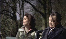
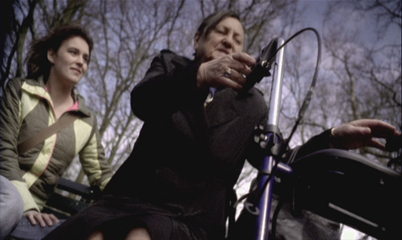
In order to make the twist in the film work, I had to make sure that viewers would devote most of their attention to the wrong woman. For this reason I placed the old lady on the right side of the bench, which is always more interesting to Western audiences than the left, because of our reading habits. (Turn the page of a comic book and your eyes will automatically be drawn to the bottom right corner of the spread. Why? Because that’s where the next cliffhanger takes place!) The girl was dressed in muted colors to merge with her surroundings, while the black coat of the old lady practically burns a hole in every frame. The walker was tactfully placed nearby the old lady instead of the girl, and like the handkerchief around her neck, it’s blue.
Everything about the old lady is a little “off”: her uncomfortable pose and facial expression, the hair on her forehead–whereas the girl beside her looks relaxed and perfectly healthy (the client was on the set to make sure her body movements were medically correct).
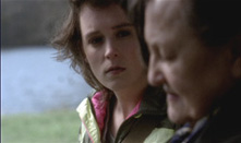
I found out that I could provoke different viewer expectations by reversing the order of shots in the editing stage. The sooner I succeeded in convincing the audience that something was wrong with the old lady, the more they would identify themselves with the poor girl next to her, seemingly unprepared for the critical situation that unfolds before their eyes. As such, the film builds up to a dramatic moment that never comes, then releases the tension and introduces subtle tragedy in the unexpected.
One of the reasons we were able to shoot this on 35mm was that Fuji liked the message of the film enough to give us seven (!) reels of 3-perf stock for free. Usually, 35mm has four perforations with an invisible space between the frames. 3-perf needs one perf less for every frame because it eliminates this space, saving you 25 percent of film stock. Not that we used all of it, mind you: We saved the rest for two other projects! I’ve grown tired of extensive coverage as an editor, you see, so I always try to shoot as economical as possible. Most of the angles were made up on location, but I ended up using every set-up. Trust me, the Dutch really are cheap…
That was a great commercial! I really enjoyed reading about the production of it, too. I’ve always enjoyed well made commercials – as Kubrick said, they’re like perfectly encapsulated short films. Is this what you do for a living? I’m looking forward to seeing more of your work — I’m glad you’re making it a regular feature!
Yes, this is my day job, so to speak–although you’ll see that my work varies a lot. I also do motion design and longform projects for TV. Right now we’re developing a cooking show with a twist…
Pingback: Screening Room: The horror! « Lost in Negative Space
Pingback: And the Socutera-Prize goes to… « Lost in Negative Space